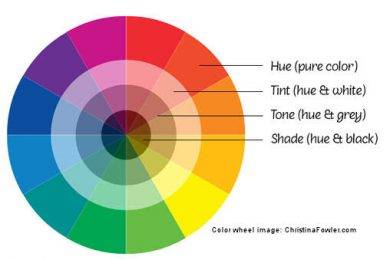
A color wheel is a guide to choose perfect color combinations for your web designs. It shows you which colors are opposite to each other, and which ones are complementary. You can use it to create harmonious color schemes for your designs. You can also use it to avoid a color clash in your designs.
A color wheel is a powerful tool that is essential for the design process. It helps you get the right color combinations and makes your designs more attractive. A Color wheel picker can be used as a guide when choosing colors for your website, logo, business card, or other design projects.
In this post, we will show you how to use a color wheel and how it can help you in the web design process.
How to use Color Wheel for web designs?
We have collected some useful tips on using the color wheel in web design below:
- Maintain harmony in colors
To use different colors in your design, it’s a good idea to choose them from the same part of the color wheel. For example, if you choose two complementary colors (colors that are opposite each other on the color wheel) they will look more balanced than using two random colors from different parts of the color wheel.
- Warm and cool colors for contrast
Warm and cool colors are opposites on the color wheel, so they create great contrast when used together in designs. Warm tones include reds, oranges, and yellows while cool tones include greens, blues, and purples. Combining warm and cool tones can be very effective in creating visual interests in your design projects such as web pages or logos.
- Analogous or monochromatic schemes for consistency
Analogous or monochromatic schemes consist of three or more hues that sit next to each other on the color wheel: Red – Orange – Yellow; Blue – Indigo – Violet; Green – Turquoise – Teal etc. An analogous scheme is an easy way to create a consistent look across all elements of your design project: logo, business card, website, etc.
- Complementary colors for highly noticeable visuals
Complementary colors are opposite each other on the color wheel: Red – Green; Blue – Orange etc. They create high contrast and stand out from the rest of the design elements. You can use them to make important elements such as text or logo more noticeable.
- Triadic scheme for vibrant web designs
The triadic scheme consists of three hues equally spaced around the color wheel: Red – Yellow – Blue; Green – Purple – Orange; Violet – Turquoise -Green, etc. A triadic scheme is a great way to create bold, vibrant designs with strong visual impact. It’s also a good choice if you want to add some variety to your business designs.
Summing Up
As you have seen that Color Wheel is highly important for making web designs, we recommend you choose Appy Pie’s Color Wheel Picker tool. It lets you create relevant color combinations and make web designs visually appealing.
The color wheel tool of Appy Pie has a simple interface and easy-to-use tools for creating color codes in a jiffy. It lets you select signature color combinations and make the perfect color palette for your business.
Try Appy Pie’s Color Wheel now!
My name is Sardar Ayaz a professional content writer and SEO expert having Proven record of excellent writing demonstrated in a professional portfolio Impeccable grasp of the English language, including idioms and current trends in slang and expressions. I have ability to work independently with little or no daily supervision with strong interpersonal skills and willingness to communicate with clients, colleagues, and management.
I can produce well-researched content for publication online and in print, organize writing schedules to complete drafts of content or finished projects within deadlines. I have 12 years’ experience to develop related content for multiple platforms, such as websites, email marketing, product descriptions, videos, and blogs.
I use search engine optimization (SEO) strategies in writing to maximize the online visibility of a website in search results


